As most people who know me will attest, I am a big fan of using gauge and bullet charts and / or altering the standard excel charts to make them more visually appealing. So when I was asked by a colleague if I could create a gauge style graph, with an arrow as an indicator of the result (kind of like a linear speedometer), my exact words were, challenge accepted.
To make sure I fully understood what they wanted, I asked them to send me a picture. This is what I received:
After further discussions, we realised that she wanted a percentage scale going from 1 – 100%. The blue arrow would move based on the indicator for that month. There are actually several ways that this chart could be made. I chose in this instance to make a bar chart. It could also be done with a column chart, though! You can download my chart and worksheet here.
Step 1: Set up the data
In this instance, my colleague had only 1 data point she wanted to display, a YTD indicator.
However, to set up the coloured scale behind the indicator arrow, we would need more data to be plotted.
For this reason, I set up two more columns:
The first will be used to created the coloured scale. In this case, the scale is even, but it doesn’t need to be, it is dependent on the visual aspect the user wishes to show.
The second column is a set of two calculations to create the width of the arrow.
E2 = B2 – 0.025 (this will find the value of the indicator minus half of the width of the arrow)
E3 = 0.05 (the width of the arrow)
Step 2: Create the basic stacked column graph
First highlight the data in column D, then click on Insert > Bar > Stacked Bar
The chart will probably look something like the one below:
We need to adjust the way the chart is displaying the data. Right-click on the graph and then choose “Select Data”. Click on the “Switch Row / Column” button and press the OK button
You should now have 5 series as shown in the chart below. Adjust the colours of the series and the chart itself as you wish. I added a grey gradient to the chart fill, removed the X axis, horizontal lines and legend and then adjusted each series so that it matched the traffic light idea with a white border.
Step 3: Add the indicator arrow
For this we need to add 2 more series. First click on cell E2 and press Ctrl+C. Then click on the graph and press Ctrl+V. The graph will automatically adjust to show the new data.
Click on the new series, and press Ctrl+1 to bring up the formatting menu box.
Choose to plot the series on the secondary axis in the “Series Options” tab and give it a gap width of “0”
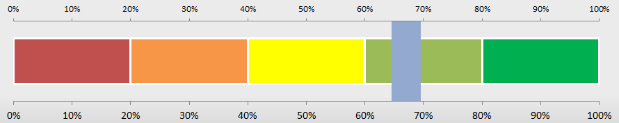
Before pressing the close button, go to the fill tab and choose no fill. Then you can close the formatting menu box. The graph should now look like the one below:
Repeat the process, this time selecting cell E3 and copying and pasting it into the chart. Your graph should look something like this now:
The next step is to adjust both of the vertical axes so that the maximum scale is 100% for both. To do this double click an axis. In the format axis menu box ensure that the Fixed Maximum = “1”
Repeat for the other axis.
You can now delete the top axis.
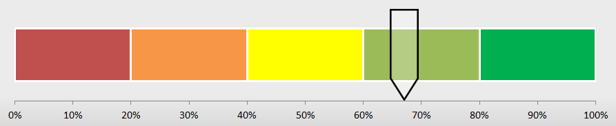
We now need to add the arrow. To do this first we insert the arrow shape. Click on Insert > Shapes > Down Arrow. Then draw the arrow on the page and adjust it to have the shape you want. You can see mine in the picture below. I’ve given it a black outline and an 80% transparent white fill.
Then click on your arrow and press Ctrl+C. Click on your seventh series (which you want to replace with the arrow), and press Ctrl+V. And voila, the chart is complete:
Obviously this is a large chart for just one data point, but you can add other points to it as well…
It’s been a while since my last post. Mostly due to the fact that I have a new position. I’ve changed jobs, changed countries and well completely overhauled my life! Now that I’ve settled in (somewhat), I thought it was time for me to start posting again. That said, I’ve received a lot of questions over the past couple of months, around Excel and Charts, so I’ll try to answer those first!
This first post came to me from a friend in France, who wanted to know a “quick and dirty” way to have a chart on a dashboard that updated when the user selected the data they wanted to view. Obviously this can be done with pivot tables and charts, however, my friend wanted something simpler and cleaner. My suggestion? Use the built in Excel data filters.
I’ve uploaded the final version for you to view here.
Step 1: Set up your data
In the uploaded example, I’ve put the data on Sheet 2, but in theory you can put the data wherever you want it to.
Step 2: Create a chart
In this example, the plan is to have 5 separate charts, one for each row of data, but I jump ahead…
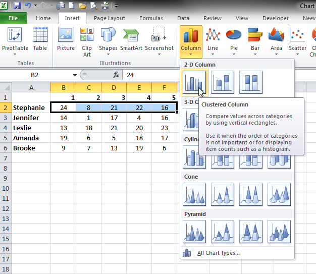
Highlight the first row of data and then click on Insert > Column > Clustered Column
This will create a column chart on the same page as your data. Format the chart how you want the final chart to look. I’ve removed the legend, the horizontal lines and I’ve widened the bars. I’ve also removed the fill colours,
Step 3: Create your dashboard
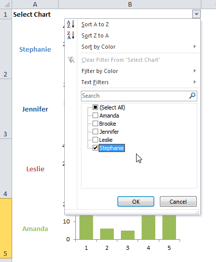
In the first cell (A1) type in the words “Select Chart”
Underneath that paste the titles for your charts. Mine shows the names of the girls. Increase the height of each row to slightly larger than the size of the chart you want to display. Then increase the width of column B so that it is wide enough to fit your chart.
Then copy / paste the chart you have created into cell B2. Make sure that it fits inside the cell B2. Make further adjustments to the chart as you wish.
Step 4: Create the other charts
Copy the chart in B2 and paste it in cell B3. Update the chart so that it shows the data in the second row of the table. In this case the row that corresponds to the name “Jennifer”. Change the format of the chart as you wish, so that it is obvious that it is showing the data for a different dataset. I’ve changed the fill colour. You could also change the colour of the names in column A to match the fill colour.
Repeat until you have a chart in each row. Note: This whole procedure will not work unless the chart is nestled securely within 1 cell.
Step 5: Add the filter
First merge cells A1 and A2. This prevents the user from seeing two filter drop downs.
Then, with the merged cells A1:A2 selected, click on Data > Filter. A drop down menu button should appear. Click on this button and choose to show only 1 result e.g. “Stephanie”.
Press the OK button. The whole table should update so that you can see just one name and 1 chart. And there you have it, a very simple dynamic chart, which can be used on any dashboard!
The font you use in a design, presentation or blog says as much about you as it does about your subject. Choosing the right one can really sell the idea you are trying to convey, or conversely make your message laughable. With that in mind, I thought I would share some free fonts that I really like. Let me know what you think!
If like me, you are in your thirties and grew up in Great Britain, the chances are you watched “Wacaday” on Saturday mornings on TVam with Timothy Mallet and Michaela Strachan. It was a wild and crazy program aimed at young children. My favourite part of the show was “Mallet’s Mallet”.
The game consisted of the host Timothy Mallet firing a random word at one of the two contestants, who then had to come up with another word that was associated with it. The other contestant would then find another word and so and and so forth. The first person to hesitate or say a word that wasn’t associated got bonked on the head with, you guessed it, Mallet’s Mallet. There’s a clip from one episode below showing a couple of kids who weren’t so successful!
Thank you to Master Six for posting the video on YouTube.
All joking aside though, I never realised the skills I was learning while playing this game. Not only do you have to think on your feet, but you have to be creative. As an adult, often people tell me I am very creative at thinking up solutions to problems, but it never occurred to me to wonder where this came from.
Word associations
That was until I learned a creativity exercise called random entry. The tool (based on work by Edward de Bono) uses a random word (noun) to help spark new ideas on for example how to solve a problem. Being able to quickly think of word associations is a big plus when doing this exercise. Thank you Mallet’s Mallet!
Edward de Bono’s Lateral Thinking tool, Random Entry, uses a randomly chosen word, picture, sound, or other stimulus to open new lines of thinking. This tool plays into the power of the human mind to find connections between seemingly unrelated things.
When you see, hear, touch, or taste something, your brain processes the information it receives based on your past experience, know how and culture. This processing involves the brain “filtering”, “labelling” and “storing” the information with similar pieces of information previously stored information for easy retrieval later. Edward de Bono calls this filter the “perceptual screen”. This screen is used to analyse each piece of new information, and determine what it is by comparing it with existing information. The information is then labelled as part of an existing thought pattern and stored. For example, I remember watching Mallet’s Mallet as a child. My perceptual screen has probably analysed that memory and labelled it as “childhood memory”, “television program”, “game” and “word association”. When someones asks me about “word association”, my brain then accesses the thought pattern containing the label “word association”, retrieves the memory and I eventually remember the television show.
Now imagine that you are trying to think of new ideas. You are thinking, “How can I motivate my team?” Your brain accesses the thought patterns labelled “motivation” and “teams”. You start to think of how you’ve motivated teams in the past, you think of how other managers you know have done it, or methods that you’ve heard or read about. In fact most (if not all) of these ideas will have been stored together in same thought pattern. Unfortunately, once you start accessing one thought pattern, it’s difficult to break out of it, and so the number of ideas you can think of is limited unless you can break out of that thought pattern. Brainstorming with someone else helps us to do that as they have different memories, experiences and backgrounds, and so their perception screen would have created different labels and thought patterns. They might think of different ways to manage the teams; different ways a team can be put together. Unfortunately, although two heads are definitely better than one when it comes to thinking of new ideas, eventually, you both will become stuck within your own thought pattern and will run out of ideas.
Lateral thinking
Lateral thinking tools like random entry however, help you to think outside of the box (i.e. thought pattern), by providing a “stepping stone” to different experiences and therefore to a different thought pattern where you can mine even more creative ideas. In short, the tool helps you to break your thought pattern, and get out of the rut your thoughts have gotten into. The trick is to associate the new thought pattern with the original question, “How can I motivate my team?”
Let’s try an example:
You have your problem, “How can I motivate my team?” You’ve already done some open brainstorming techniques and been really creative. Your mind has been working overtime doing research and drawing from your past experience, know how and culture to think of good ideas. Unfortunately now you’ve exhausted the pool of ideas available within this thought pattern.
This is where you start to use the tool. You look outside the window and see a bird perched on a fence. Your random word will therefore be “bird”. Note there are lots of random word generators available on the web as well, if you truly wish for a random word! I like this one in particular: random word generator
Once you have your random word “bird”, first use word association (Mallet’s Mallet) to find 5 new words. So when I think of the word bird, I remember going bird watching as a child with my father, and using binoculars. There, I have a new word. My first new word is “binoculars”.
Then when thinking again about the word “bird”, I start to think of different kinds of birds and I think of a “Robin”. Robin is therefore my second new word. The idea is to continue until I have 5 new words. My five were:
Binoculars
Robin
House
Bath
Cage
I can now ignore the word “bird”. Instead I take my first new word, “binoculars” and I try to come up with a link between binoculars and the problem “How can I motivate my team”. To do this, I use more word association. So when I think of binoculars, I think of eyes, I think of sight, and glasses. Then I remember how much my last trip to the opticians cost and how unhappy I was. I needed new glasses due to spending a lot of time working in front of the computer. And then the new idea hit me. Maybe the company could start a scheme where if you needed glasses and used computers a lot at work, the company could help to pay for the glasses. This would certainly make me feel happier and I would think more positively about the company. Thinking of my team, the scheme might inspire more loyalty in the team as a lot of them wear glasses. Eye strain causes headaches, and the lack of both of these might make my team more productive.
Once the idea is fully formed, I go back to the word “binoculars”. I try to think of other associations. Binoculars are like telescopes, and there is an observatory near by. Perhaps the company could pay for family trips to local venues like the observatory, the zoo, or even further afield like Alton Towers.
The word binoculars still makes me think of sight (I’m in a new thought pattern!), and then I remember Google glasses. I start to think “What does Google do to motivate their teams?” They have relaxation rooms and wide open spaces to prevent stress build up in the work place. Could we implement something like this in the company? What are other companies doing to motivate their teams, perhaps we could benchmark?
Once you’ve exhausted the new word (and new thought pattern) you simply move onto the next new word and start again. If that word doesn’t inspire you creatively, you simply move onto the next word. Generate as many ideas as possible, working them from initial concepts to fully formed ideas.
What do you think? Could this tool help you to generate new ideas and solutions?
Incidentally, for all those (like myself), who begged their parents to get them a mallet’s mallet for Christmas and were sorely disappointed, you can buy your very own Mallet’s Mallet here Mallet’s Mallet. While I am sure this TV program isn’t the only reason I am creative, I am really glad I practiced the game so hard as a child!
I found a great post yesterday regarding games in PowerPoint and thought it would be useful for all those trainers and PowerPoint users out there… PowerPoint Games – Josh Kohnert.
There are 7 games in total on the site:
50,000 Pyramid
Family feud
Battleship
Jeopardy
Connect 4
Who wants to be a millionaire
Wheel of fortune
This slideshow requires JavaScript.
They are free to download and use.
I’ll also be posting how to create a Blockbuster game and a Crossword in Powerpoint over the next few days
I have to say I normally hate advertising with a passion. Especially when it interrupts my favourite television show or movie. That being said, I saw these really great advertisements and I couldn’t help but share them.
Generally speaking, though, I suspect that depending on when the readers see an advert and how great it is, will depend on whether they love or hate it. For an advertisement to be great, it must be bold, easy to read and memorable. Less is definitely more. It needs to strike a chord within the minds and hearts of the readers. It needs to impress the viewer / reader. While humour is always a plus point, it needs to meet taste standards as well as meeting everyone’s sense of humour. Very very difficult, which is why when I saw these I had to share:
Getty images
Tagline: Images In Real-Time from the Olympics
Mylanta antacid
Tagline: Relieves indigestion & wind fast.
Alka Seltzer
Tagline: Hangover is dangerous
Total
Tagline: Clean laundry, even with cold wash.
B&B hotels
Don Pion flowers delivery
Tagline: Make an impression. Like Van Gogh did it.
Berger
Tagline: Natural finish colours
Lego
Aspirin
Tagline: For workache
Neo Rheumacyl Forte
Tagline: For unbearable joint pain
Which did you like? Did you want to buy the product?
“Your problem is to bridge the gap which exists between where you are now and the goal you intend to reach” by Earl Nightingale
I was sent this quote yesterday by a colleague who wanted to use it in a presentation. She asked me if I had any good images that would highlight the key message. The main topic was identifying training needs and using the skills already within the team to bridge the gaps. I thought of using a lighthouse, of a long road with a light in the distance and of course of using a bridge. In the end I found this picture on slideshare by Raymond. You can find more of his work here: http://raym.deds.nl/indexeng.html. Some of his work is just phenomenal, so I just had to share!
A colleague of mine uses a lot of bubble charts and wanted a simpler way to compare the data in each chart. I have to say I am not a big fan of bubble charts as I find them difficult to analyse and compare, however I accepted the challenge! This is what I proposed:
The chart is actually quite simple and I’ve uploaded it here if you wish to see how it was done. Each line is set up on a different tab, (data1, data2, etc) but in essence, each line of bubbles in the chart has a different number in the Y axis column. For the first line, the value is 22, for the second line, the value is 17 and so on until the last line which has a value of 2. The value column gives the size of the bubble and the date column is uniform to allow the positioning of the centre of each bubble.
If like me, you like to create interesting graphs in Excel, you may have wondered at one point or another whether it is possible to have pictures on your axes instead of text. In actual fact it is really very easy to do this. You just need to install some dingbat fonts (e.g. wingdings and wingdings 2) on your machine. Then simply adjust the font of the axes to match the font (and icons) you want to use.
For example, in the graph below I have used a font called “Social font face” which is free to use for personal use.
Personally, I think the logos of the different types of social media are a lot easier to read and more recognisable than text.
I’ve enclosed the two excel spreadsheets here for you to download and use: social media & face.
What do you think? Is it useful? I think if you are wanting to grab attention and or present data in an interesting way, it can be great, however, it can also be overdone and look unprofessional if you choose the wrong icons, so be careful.


 However, to set up the coloured scale behind the indicator arrow, we would need more data to be plotted.
 The first will be used to created the coloured scale. In this case, the scale is even, but it doesn’t need to be, it is dependent on the visual aspect the user wishes to show.
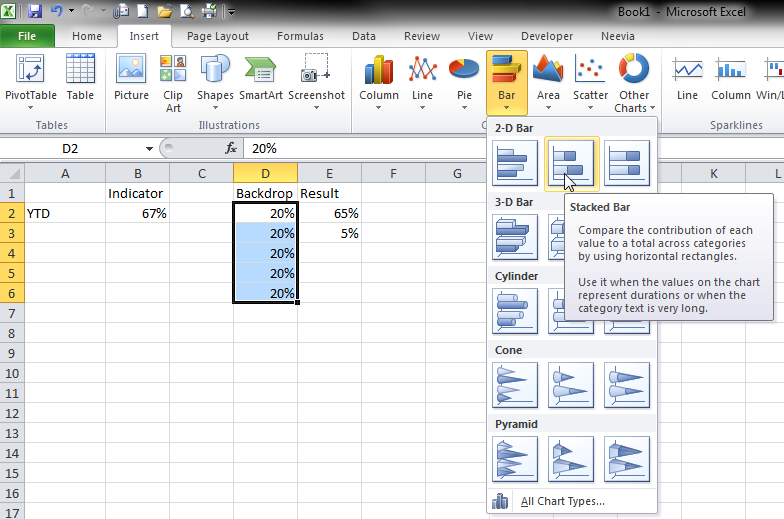


 Before pressing the close button, go to the fill tab and choose no fill. Then you can close the formatting menu box. The graph should now look like the one below:


 Word associations
 Once you have your random word “bird”, first use word association (Mallet’s Mallet) to find 5 new words. So when I think of the word bird, I remember going bird watching as a child with my father, and using binoculars. There, I have a new word. My first new word is “binoculars”.


