
As most people who know me will attest, I am a big fan of using gauge and bullet charts and / or altering the standard excel charts to make them more visually appealing. So when I was asked by a colleague if I could create a gauge style graph, with an arrow as an indicator of the result (kind of like a linear speedometer), my exact words were, challenge accepted.
To make sure I fully understood what they wanted, I asked them to send me a picture. This is what I received:

After further discussions, we realised that she wanted a percentage scale going from 1 – 100%. The blue arrow would move based on the indicator for that month. There are actually several ways that this chart could be made. I chose in this instance to make a bar chart. It could also be done with a column chart, though! You can download my chart and worksheet here.
Step 1: Set up the data
In this instance, my colleague had only 1 data point she wanted to display, a YTD indicator.
 However, to set up the coloured scale behind the indicator arrow, we would need more data to be plotted.
For this reason, I set up two more columns:
 The first will be used to created the coloured scale. In this case, the scale is even, but it doesn’t need to be, it is dependent on the visual aspect the user wishes to show.
The second column is a set of two calculations to create the width of the arrow.
- E2 = B2 – 0.025 (this will find the value of the indicator minus half of the width of the arrow)
- E3 = 0.05 (the width of the arrow)
Step 2: Create the basic stacked column graph
First highlight the data in column D, then click on Insert > Bar > Stacked Bar
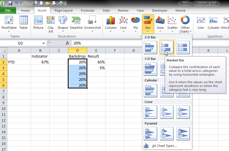
The chart will probably look something like the one below:

We need to adjust the way the chart is displaying the data. Right-click on the graph and then choose “Select Data”. Click on the “Switch Row / Column” button and press the OK button

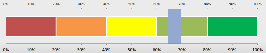
You should now have 5 series as shown in the chart below. Adjust the colours of the series and the chart itself as you wish. I added a grey gradient to the chart fill, removed the X axis, horizontal lines and legend and then adjusted each series so that it matched the traffic light idea with a white border.


Step 3: Add the indicator arrow
For this we need to add 2 more series. First click on cell E2 and press Ctrl+C. Then click on the graph and press Ctrl+V. The graph will automatically adjust to show the new data.

Click on the new series, and press Ctrl+1 to bring up the formatting menu box.
Choose to plot the series on the secondary axis in the “Series Options” tab and give it a gap width of “0”
 Before pressing the close button, go to the fill tab and choose no fill. Then you can close the formatting menu box. The graph should now look like the one below:

Repeat the process, this time selecting cell E3 and copying and pasting it into the chart. Your graph should look something like this now:

The next step is to adjust both of the vertical axes so that the maximum scale is 100% for both. To do this double click an axis. In the format axis menu box ensure that the Fixed Maximum = “1”

Repeat for the other axis.
You can now delete the top axis.
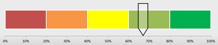
We now need to add the arrow. To do this first we insert the arrow shape. Click on Insert > Shapes > Down Arrow. Then draw the arrow on the page and adjust it to have the shape you want. You can see mine in the picture below. I’ve given it a black outline and an 80% transparent white fill.
![]()
Then click on your arrow and press Ctrl+C. Click on your seventh series (which you want to replace with the arrow), and press Ctrl+V. And voila, the chart is complete:
Obviously this is a large chart for just one data point, but you can add other points to it as well…

Have fun!
Related articles
- How To Make Awesome Ranking Charts With Excel Pivot Tables (moz.com)
- Dynamic Charts using Excel Filters (alesandrab.wordpress.com)
- Tired of crowded bars? The dot plot hits a sweet spot! (inspari.dk)
- Creating More Professional-Looking Graphs Using Microsoft Word And Excel (camerona2650.wordpress.com)
- Australia Excel Bar Chart (visual.ly)

Reblogged this on Sutoprise Avenue, A SutoCom Source.
Hello, what if I want to have two indicators on the same graph?
Lets say if I want to have monthly and YTD status on the same score meter?
You mean like the 2 stars on the last picture?
yes, or like one picture above it.
I want to have two different “indicators” (monthly and YTD standings) on the same line. If I try to do the second indicator the same way I did the first one, well, the values are not correct (axis range is not the same anymore)…
Send me your file (alesandra@about.me) and I’ll talk you through it!
hey,
I have sent you a file.
Thanks
Will look at it and let you know
Hi again,
I’ve looked through your file and sent you one back. Basically you are putting a stacked chart on the primary axis and a stacked chart on the secondary axis, so your “indicators” cannot overlap. You can however have 2 as long as you calculate the distance between them and set up your secondary stacked chart accordingly. Hopefully this makes more sense when you get the file. Good luck!
i am having a little issue with getting the arrow move into the Negative, is there you can help with that.
Can you post a picture?
Hey Alesandra you are awesome.stay blessed.
Thank you for inspiring me!
I just used your method and it works great! I am having some trouble changing the colours of the stacked bars but I’ll figure it out. I agree with the last comment by Zahid….you are awesome! I’ve tried this five different ways using five different tutorials and none worked. Thank you so very much!
What a great tool and very easy to follow instructions
Brilliant visualisation – thanks for sharing!
I’m truly impressed with your concept here and it was exactly what I needed. I found nothing else like it out there even all these years later. It is inspired work and brain candy to boot. Thank you!
This is awesome! Here’s my challenge – I’d rather just download the file and edit/incorporate it into my lesson on MBTI as a way for the students to plot their scores virtually since we’re not in the classroom and would normally just go to the board. Is there a way to purchase the file?
There’s a link to download the file in the second paragraph. It’s free.
Many thanks! I was looking around quite a bit for something like this. Seems so simple, but appreciate you walking through the steps here so thoroughly!