
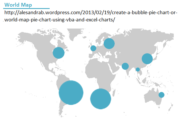
Way back in February of 2013, I published a how to guide on how to create a world map pie chart using vba and Excel.
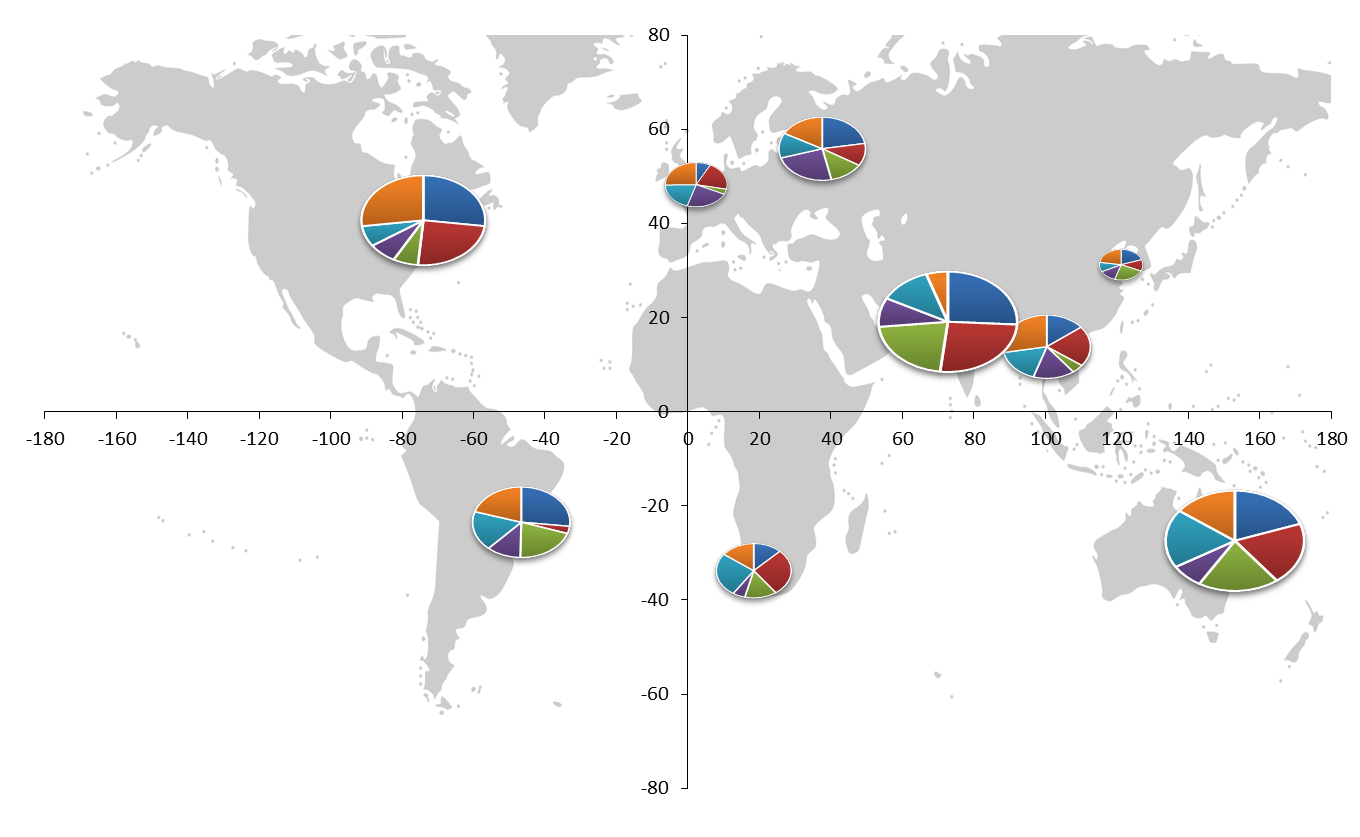
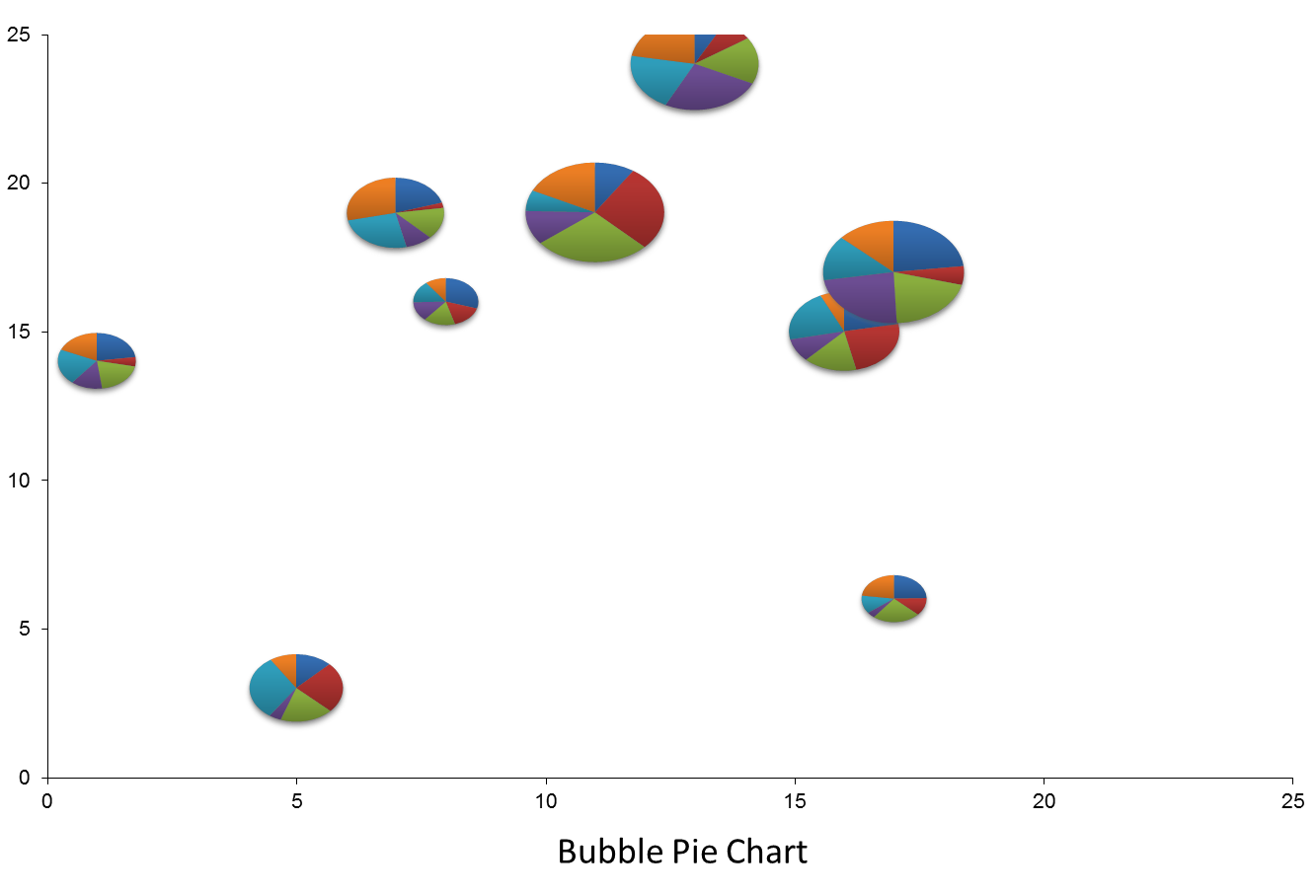
Although I wrote the how to, the original work was of course done by Andy Pope. The post also shows you how to create a basic bubble pie chart:
Since then I’ve had a few requests for modifications. One I posted as an example in this post: 20 excel charts for your dashboards:
Another was to create a line chart in combination with a bubble chart. Kind of like this:
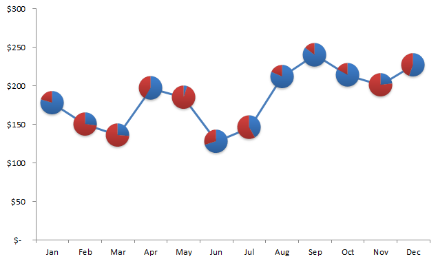
Well in essence the principle is the same. You can download my sample sheet here.
Step 1: Create the data table
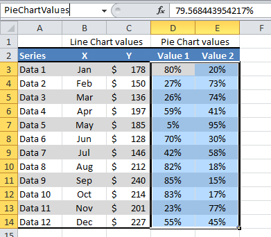
Imagine you have a data table like the one shown below. Columns B and C represent the line chart data values. Columns D and E represent the pie chart values. Each row of data represents a pie chart you wish to create with 2 segments per pie chart.

Create a named range by highlighting cells D3:E14 (the pie chart values) in your data table and then typing the new name “PieChartValues” in the name box.
Step 2: Create a sample pie chart
Using the Data 1 row, create a pie chart. Remove the fill of the chart and the outline, leaving only the two segments of the pie chart. Open up the selection pane (Home > Find and select > Selection pane) and rename the graph “chtMarker”. Format the segments as you wish:

Step 3: Create the line graph
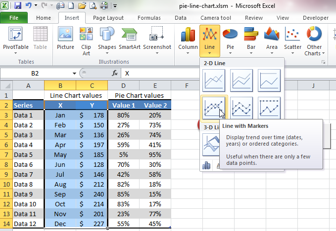
Highlight the columns B & C of your data table, and insert a line chart with markers (Click on Insert > Charts > Line > Line with Markers).
 Open up the selection pane (Home > Find and select > Selection pane) and rename the graph “chtMain”.

Step 4: Add the vba
If you are using my sample worksheet, then at this point, all you need to do is press the Update Charts button on the worksheet. Otherwise, add the vba code below in Module 1.
Sub PieMarkers()
Dim chtMarker As Chart
Dim chtMain As Chart
Dim intPoint As Integer
Dim rngRow As Range
Dim lngPointIndex As Long
Application.ScreenUpdating = False
Set chtMarker = ActiveSheet.ChartObjects(“chtMarker”).Chart
Set chtMain = ActiveSheet.ChartObjects(“chtMain”).Chart
Set chtMain = ActiveSheet.ChartObjects(“chtMain”).Chart
Set rngRow = Range(ThisWorkbook.Names(“PieChartValues”).RefersTo)
For Each rngRow In Range(“PieChartValues”).Rows
chtMarker.SeriesCollection(1).Values = rngRow
chtMarker.Parent.CopyPicture xlScreen, xlPicture
lngPointIndex = lngPointIndex + 1
chtMain.SeriesCollection(1).Points(lngPointIndex).Paste
Next
lngPointIndex = 0
Application.ScreenUpdating = True
End Sub
Please note, you must save the file with the extension *.xlsm if you want the macros to work. You can also easily substitute the named range if you wish, by simply typing in the cell reference e.g. (“E4:J12”) instead of (“PieChartValues”).
Create a button on the page using the developer tab and assign the macro above to it. Then click the button. Adjust the data as you wish and click the button again. The chart should update.
Enjoy!

2 thoughts on “Combination Line & Pie Chart”