
Sometime last week, I posted a blog regarding how to make your charts look amazing. Afterwards a colleague asked me how to make one of the charts; the conditional line chart (slide 8).

Actually it’s quite simple. The key is in the set up of the data. You can follow the process through with this example spreadsheet. Imagine you have a table of results, similar to the one below:

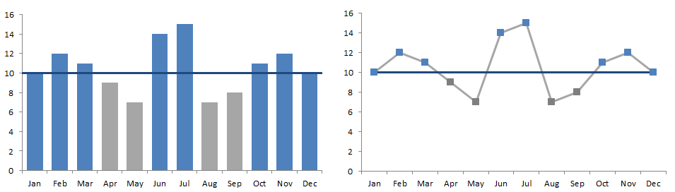
You’ve added icon sets using the conditional formatting in excel and now you want to show these results in a chart displaying the results above and below target, either as a column graph, or as a line chart. To show you what I mean, I’ve posted a picture below, showing the results and the target lines in both graphs. I’ve selected blue as being above target and grey as being below, but you can use any colour!
So how can you do it?
Setting up the data
Regardless of whether you want a line chart or a column chart, you need to pre-prepare the data.
- Add 3 new columns entitled “<target”, “>=target” and “Target”.
- In the first new column (“<target”), type in the formula below in the first line of the table (note the use of the dollar symbol):
- =IF($C3<10,$C3,NA())
- This assumes that your original results are in column C, rows 3 to 10 and that the first row of data is in row 3. You can of course change this. Basically, the formula checks the result in the same line as the formula. If the result is below target (10), it will show the result. If not, it will show #N/A – written in excel formula as NA().
- Copy and paste the formula in the first row to the next column, then change the “<” symbol to “>=”. The $ symbol before the C should prevent Excel from transposing the column. The formula should read:
- =IF($C3>=10,$C3,NA())
- This will do a similar function to the previous formula except it will only display the result if it is greater or equal to the target (10) or display #N/A.
- Copy and paste the formula in the first 2 columns down the table to fill each row.
- Type in the target in the third column.
- Add conditional formatting if you wish etc.
- Your table should now look something like this:

Create a bar chart with target line
- Click on the insert tab > column chart > stacked column.

- Set up the three series using columns “<target”, “>=target” and “Target” and give each series a name e.g. “Below target”, “Above target” and “Target”.
- Add the Horizontal axis labels (the date column) and press the OK button.

- Your chart should look like this:

- Right click on the “Target” series and choose “Change series chart type”.

- Change the series chart type to a normal line graph and press the OK button.
- Your chart should now look like this:

- Delete the legend.
- Delete the major axis grid lines and colour the series’ etc as you wish. Again, I’ve chosen blue for above target and grey for below target, with a dark blue line for the target.


- If you wish to extend the target line as shown in the original drawing follow steps below.
- Click on the target line and press Ctrl+1 to open up the format data series menu box.
- Choose to plot the line series on the secondary axis and press Close. The graph will automatically update.
- On the ribbon, click on Chart tools > Layout > Axes > Secondary Horizontal Axis > Show Left to Right axis.

- Double click the new horizontal axis at the top of the graph.
- At the bottom of the Axis options, choose to position the axis “On tick marks”.

- Then change the Major tick mark type to None and Axis labels to None and press the Close button.
- With the axis still selected, click on Chart tools > Format > Shape Outline > No outline to remove the remaining line at the top of the chart.
- Double click the secondary vertical axis and adjust the scale to match the primary vertical axis on the left and then delete it. Your chart is done!

Create a conditional line chart
- On the ribbon, click on Insert > Line > 2D Line > Line chart.
- Right click on the chart object and click on Select Data.
- Add the four series as shown below (in the same order!):

- Click on the Results series and Add the dates as Horizontal Axis labels and press the OK button.

- Click on one of the series, and press Ctrl+1.
- Set up the formatting as shown below (use the Chart tools > Format tab and Current selection part of the ribbon to help you select the different series). I’ve used the same colours as for the bar chart:


- Results series: Grey line, no markers
- Below target series: NO LINE, grey markers, with grey marker line
- Above target series: NO LINE, blue markers, with blue marker line
- Target series: Dark blue line, no markers

Note: The reason we used #N/A in the data set up, was so that excel doesn’t plot a “0” in the gaps where the data is missing in each series.
The chart is complete. Remove the legend and horizontal grid lines as you wish! Please feel free to download and use the example spreadsheet. Enjoy!

Thanks a lot for writing “Create charts with conditional formatting”. I actually might really wind up being back again for even more browsing and commenting here soon enough. With thanks, Susie
Many many thanks 🙂
Thanks so much for this tutorial. It was very helpful!
Would you happen to know how to apply conditional formatting to a pivot chart that has a report filter?I was almost successful but I have one more roadblock. Any clarity would be great!
Formatting pivot charts is difficult to say the least. DO you have the addin PowerPivot? This gives you a few more options…
Brilliant! Nice, innovative way to do this without using VBA.
THANK YOU VERY MUCH!! This was sooo helpful
Tks Heaps !!
Great Solution.
Helped me alot