This seems to have been a week of Excel challenges for me. First there was the Metro UI style Excel dashboard challenge from a close friend of mine. Then yesterday I was asked if I could make a chart that looked like a graphic equaliser to represent some sound readings in a very visual way. Challenge accepted!
We all know what a graphic equaliser looks like:
My first thought was this should be relatively simple. All I need is to draw a bar like shape (small thin rectangle) on to the page. Then create a normal bar chart. Then copy the bar, press Ctrl+1 and use the contents of the clipboard as the fill, stacked and scaled with 1 bar per unit of data. Much like what I did to create the arrow chart earlier in the year.
What I actually got was not so pretty:
Without an outline, each bar merged into the next, making the graph look exactly like a normal bar chart. So I put my thinking cap back on and realised that I needed two bars, a white one behind the coloured one to space out the lines. This time was better, but still quite boring:
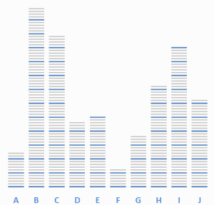
Then I started formatting. I removed the Y axis and increased the size of the X axis font. That’s when I realised that it was completely impossible to read the values without the Y axis. So I decided to add coloured graduations, by creating a group of 5 coloured bars (four grey bars and 1 blue bar to mark the 5th graduation), again with a white background. Of course then I had to stack and scale the picture fill by 5 units for the five coloured bars:
Now we were starting to cook with gas. I went back to the internet at this stage and started looking for some great pictures of a graphic equaliser. I quickly realised that I needed a black background, and perhaps a rainbow gradient with my coloured bars, going from green to red. This meant having 70 coloured bars with a black background, and again changing the fill to stack and scale to 70 units – a lot of formatting, copying and pasting! Also, since most of the pictures I saw had a reflection of some sort, I needed to use the camera tool (see this post for more details) to get a realistic image, which will of course update automatically:
Just in case, I also created a bar chart version as well, with different values to see how it would look. What do you think? The full excel file can be found here. Enjoy!


Hi Alesandra,
Who knew this was possible? Not me. Thanks for the file, I’ll get to use it I think.
Cheers,
Michael
You are welcome, glad you found it useful!
Alesandra
Very cleaver! I have been thinking about how to create a vertical color gradient within a single chart, with say a blue filled circles represents lower temperature points, yellow or orange representing intermediate temperatures, and dark red representing high temperature points, with the x-axis being time of year. I don’t think I seen this type of a data representation in Excel. Any thoughts? Ted
You could use the same method as this one, but let me think about it and I’ll get back to you with a post if there’s a better way. In the meantime, send me your data and I’ll have a look. Alesandra@about.me
Hi Alesandra…this is amazing! I come across plenty of charts on my job but I’ve never seen one as cool as this one. I was hoping to use it for some charts I have to prepare but came across an issue. I was trying to have the colour scale upside down so low values are highlighted in red and high values in green. I thought it would be easy and a matter of turning upside the picture but it didn’t work. Do you have any tips on how I can achieve this?
All the best!
Hi Tony, that version uses the picture tool as well as the original chart so that you get the reflection. Perhaps you should check the original chart?