
I was asked how to do this recently by a colleague, so as usual I decided to turn it into a blog!
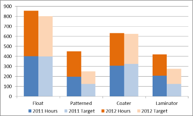
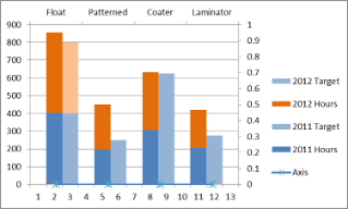
A lot of the people I work with don’t have access to statistical software like JMP and minitab and have to rely on Excel. For many, this limits their ability to show complex information in charts. For example, say you want to create a combination stacked clustered bar chart like the one shown below:
Unfortunately it is not very simple in Excel.
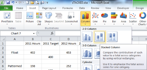
How can you do it? Well, let’s imagine that your have the data as shown below:

The first thing you need to do is to separate the data into lines with spaces in between. To get a chart arranged as above we need to make the data look like this… (I will explain columns F and G later).

Then we need to select B1:E14 and click on the insert tab, then select the small drop down arrow below column in the Charts section and then choose the second 2-D Column chart type.
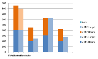
You can then format your data series so that they look more coherent. Left click on the first data series you wish to change then press Ctrl+1 to bring up the format data series dialog box. Click on Fill, then solid fill and change the colour. Then click on the next series and repeat until all of the series are correct.

Once the chart looks like the second one above, click on the series options tab. In the gap width section, move the slider until it shows no gap or 0%. The graph will update autolatically and you can press close.

We now need to adjust the axes. This is where columns F and G are important. First select cells G1:G5 then with these selected, hold down the CTRL key and then select cells F1:F5 and press CTRL+C to copy.

Left click on the graph and then click on the home tab. Left click on the small down arrow below paste and choose paste special.

Ensure the options shown below are selected, then click on OK.

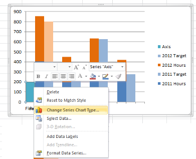
The chart will update as shown below.
Temporarily put a value in cell G2 e.g. 200, so that you can see the value in the chart. Then right click on the value in the chart and select “Change Series Chart Type”.
Then choose the first of the line chart options and click on OK.

Change cell G1 back to blank. Then click on the layout tab and ensure that the series “Axis” is shown in the current selection box. If not select it using the drop down arrow.

Press CTRL+1 again to see the format series menu box and select secondary axis. This will add a vertical axis on the right hand side of the chart. Press Close.

Then click on the small drop down arrow of the Axes button in the Axes section. Click on Secondary Horizontal Axis and Show Left to Right Axis.

This will add a second axis above the chart.
We now need to move the top axis to the bottom. To do this, left click on the left vertical axis and click CLTRL+1. Select the last check box in the Axis Options tab so that the Horizontal xis crosses at the maximum axis value.

Then click on the Right vertical axis and ensure that the Horizontal axis check box is showing automatic.
Then click on the top axis. In the Axis options tab, at the bottom in the Position Axis section, choose the “On tick marks” check box. this will adjust the graph so that there is only a half space before and after the columns.

Select the right hand side vertical axis, which is scaled from 0 to 1, and delete it.
Format the top horizontal axis, which is scaled from 1 to 13, and format it so it has no tick marks or tick labels, and no line type.

Finally, double click on the the Axis legend entry. Press Delete. Left click on the Axis line and / or markers and then format the Axis series to be invisible (no marker, no line). Then press close. You can also move the legend to the bottom of the chart etc if you want.

Thanks! This helped me a lot.
thanks for this tutorial, I made https://lokaci.com excel sheet with the help of this.
Thanks so much for this! 🙂 The detailed instructions really helped!
You are welcome!
OK- this works!
I am amazed you unraveled the necessary steps to provide a very common and useful view of data.
It was not as ‘easy’ as I had hoped, but excel still lacks some of the sophistication, out of the box, that we need to visualize our data.
Your instructions were very detailed and accurate, so thank you for putting this together!
Very good instructions. Thanks!!!
Is there a way to add a line ? In my case I have a 3 different savings types(stackings) that I am showing for Projected & Actual (side by side columns) ; I also need to run a line that indicates what the target was/is. I figured out how to add a “Target” column. When I select the Target column/select change series/select line with markers, I get just the markers…no line. Any ideas? Thanks
I am responding to my own comment/question. I figured out how to add a Target line. To add one, simply fill in values under “Axis” as shown above. The difference is; I will call it “Target” instead of “Axis” and keep it in the legend.
yes, very helpful, thanks!
Thanks!! Helps make analysis much more insightful
Holy shit this is a life saver – thank you so much for posting!
You are welcome! Enjoy.
Hi there, I check your blogs on a regular basis.
Your writing style is witty, keep up the good work!
Thanks a lot !
Hey Alesandra, great post, thanks a lot!
Very helpful indeed. Thanks.
Anyone daring enough to write some code to automate this?
Hi There
Very helpful but when do you change the line graph back to a column graph? Am I missing a step somewhere?
You don’t actually need to as the series that is turned into a line is a zero series.
I am creating a clustered and stacked chart, but do not want the values to add. Rather I want the value of one to be part of the value of the other, for example 9 superheroes out of a total of 25 possible superheroes. I would greatly appreciate your advice!
It sounds like you don’t actually need a stacked chart, just a normal bar chart with the series plotted on the 2 secondary axes.
Thanks very much for this! How you worked out how to do this I’ll never know but very nice!
Alesandra: This was excellent!!! You actually explained each step in a way that could be followed, unlike a few others that I had tried. Thanks so much.
Thanks for sharing your thoughts. I truly appreciate your efforts and I will be waiting for your further post thanks once
again.
Wow this is awesome. My bosses are impressed. Thanks!
thanks for this 🙂
do you know how to transform this 2D charts into 3D?
i tried to make it into 3D but the labels were gone.
Remove the labels and add them again afterward. They are probably just hiding
This helped me a lot(trying to do that for so long…)!!! Thanks from France! Now I see why it was good to learn english after all^^
This was great. I’m amazed how did you sort it out and explained it so easily
Thanks a lot Alesandra, this is very helpful. I need to add a line series to this chart though, and I’m having a hard time since it contains dates as X and numbers in the same order of magnitude as in the first two series. My chart has nine series instead of four like yours but it’s not what causes the challenge. I’m using both horizontal axes so I’m out of options it seems. Any idea?
Can you send me the data and I’ll have a look.
Yes I will. I have another one that I need to do first though. How do I send it to you?
Ok I found your email address on your site.
Hi Alesandra, THANK YOU so, so much for this information! It’s been almost an impossible task to figure this out with so little information on this topic online. I also have the same question as Jase above, I’m trying to add two line series but having a hard time doing so, since the lines are a projection for 2015 and my two stacked columns represent 2014 and 2015 revenue.
Send me the file and a picture of what you are expecting and I will have a look!
Hi,
Thanks for a really useful post. I went through 3 other posts on the same topic before having complete success with this one. A few points which I hope will help:
– In your screenshot showing the data with spaces added, there should be an empty row between rows 4 and 5.
– You spoke about the “On tick marks” check box. It is actually a radio button.(Really small point but it might cause some confusion.
Allon
Thanks Allon!
Thank you so much! I needed this for a work presentation – you saved the day!
Life Saver 🙂
Excellent write up – thank you so much for your thorough explanations and screen capture images. Outstanding!!
Fantastic step-by-step explanation – thanks so much, the College loved seeing out data laid out like this!!
You’re the best, so helpful!
Hi Alesandra,
Am looking out to add two cell values in one Clustered chart. For ex: Total is 700, off which 250 as Passed. I need to represent this in one single bar within 700 as total & 250 should be within the part of 700.
How to add or club within one bar? When I tried, the bar depicted to a total of 700+250=950 & after 700, 250 represented above with a different color.
Hi,
It’s all in how you set up the data. You need to calculate the difference and plot that rather than the actual figures. Dos that make sense?
Thanks for stopping by!
Hi Alesandra,
I worked through the step-by-step instructions and was able to replicate your results using 2 years.
I tried it with 5 years with no success.
I tried again with 3 years in the hopes of getting three stacked columns but it takes the additional information and stacks it on the first 2 columns.
Is this possible?
Thank you
No – sorry this is not possible.One series is plotted on one axis the second year on another axis – there is no way to add a third.
The reason this type of chart works is because Excel tries to graph every cell in the data ranges provided, but when the data is blank it leaves it out. If you look at the first row of data provided (402, “”, 453,””), you will notice the two valid numbers are elements of the first stacked column. The second row comprises the elements in the second stacked column (“”,400,””,400), and the third row comprises the elements in the third column (“But the third row is blank”, you might say. Exactly! The third column is the blank space between the first set of stacked columns and the second set).
If you wish each column to have three years (like 2011, 2012, 2013), then add two more columns after 2012 and continue the staggered pattern on the rows. If you wish there to be three stacked columns in each grouping, you have to add a row between each blank row that I mentioned before, and add the data in the new row.
For example, I used this tutorial to make a grouping of one stacked column (a target) and a stacked column with four components (to reach the target). The first few rows looked like:
(Year 0, Target, “”, “”, “”, “”)
(“”, “”, Component1, Component2, Component3, Component4)
(“”,””,””,””,””,””)
(Year 1, Target, “”, “”, “”, “”)
(“”, “”, Component1, Component2, Component3, Component4)
(“”,””,””,””,””,””)
Or you could graph a group of three stacked columns by adding another row:
(Year 0, Target, “”, “”, “”, “”)
(“”, “”, Component1, Component2, “”, “”)
(“”, “”, “”, “”, Component3, Component4)
(“”,””,””,””,””,””)
(Year 1, Target, “”, “”, “”, “”)
(“”, “”, Component1, Component2, “”, “”)
(“”, “”, “”, “”, Component3, Component4)
(“”,””,””,””,””,””)
Thank you. I appreciate you getting back to me.
Send me your data and I’ll have a look. There maybe something I can do!
Thanks a bunch! Saved me much heart ache.
Excellent explanation ! Thank you so much for this post .
Thank you Thank you Thank you!
Hi Alesandra,
Thank you so much for providing this resource! This was just what I needed for the project that I’m working on.
This was great! Very helpful.
This article just saved my ass. Thank you!!
Very helpful, thank you so much 🙂
Amazing! Thank you!!
I tried two other step-by-step tutorials to do this and failed until I found this. No other tutorial presented the steps as simple and thoroughly as this one. Thank you!!
I cannot begin to thank you enough for posting these instructions. They were exactly what I needed to prepare a chart for work. It was very helpful. Thank you again.
Thank you very much!
Thanks so musch, very helpful!
Thanks a ton!! Referred this again.
Thanks a lot.
It was suprlemely helpful.
And is there a way to add a line chart to the same graph?
Very very helpful! thanks a bunch
Excellent really helpful thanks.