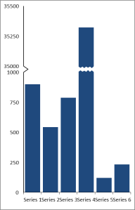
A long time ago now, I wrote a “how to” guide for creating a broken column / bar chart. Since then I have been inundated with requests for variations on this chart. The one I get the most often is “How can I create a broken column when I want to show more than one data set (and therefore already have a stacked bar chart before I add in the break and after columns). Note: If this doesn’t make sense – allow me to explain!
The original post creates a broken column chart using a standard stacked column chart to create the before, break and after series combined with an XY scatter chart to create the custom axis as shown in the picture below.
However, if you want to have multiple data sets and already have a stacked column, it can make altering the template file I gave difficult. The request I liked the most showed land area and water area for each US state.
As you can see there is a large gap between Alaska and the other states in terms of total land mass. What we need is a chart more like this:
It makes it a little easier to see some of the detail than the earlier chart! Of course, you could have the break at any point, or have multiple breaks, so long as you can do the calculations.
The answer to how to do it is all in your preparation. Work out where you want the break to be and plot your basic data first – including your multiple series. Then once you have your stacked column data you can work out your custom axis using the data labels. I’ve attached my work to create the graph above here, so hopefully those of you who want to use it can alter it accordingly. If you need the basic how to, don’t hesitate to go back to the original post!
Hope it helps!


