Excel milestone timeline – version 2!!!

Some of you may remember that I created a post a while back on how to make a milestone timeline in Excel.  It has proven to be quite popular to the extent that I’ve been asked for modifications!

You will hopefully remember that the original looked like this (you can also click on the image to go back to the original post):

chart 8

The modification I was asked for was to make the timeline into a series of bumps and / or steps!  Well, challenge accepted!  Here is the finished result:

Excel-timeline 2

You can find the finished Excel version here: excel-timeline 2

Alesandra Blakeston

How to make a graphic equaliser chart in Excel

This seems to have been a week of Excel challenges for me.  First there was the Metro UI style Excel dashboard challenge from a close friend of mine.  Then yesterday I was asked if I could make a chart that looked like a graphic equaliser to represent some sound readings in a very visual way.  Challenge accepted!

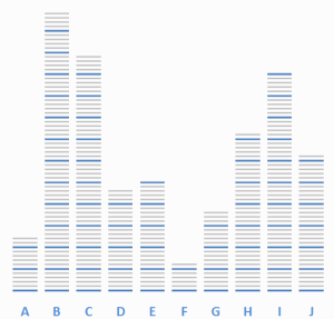
We all know what a graphic equaliser looks like:

images

My first thought was this should be relatively simple.  All I need is to draw a bar like shape (small thin rectangle) on to the page.  Then create a normal bar chart.  Then copy the bar, press Ctrl+1 and use the contents of the clipboard as the fill, stacked and scaled with 1 bar per unit of data.  Much like what I did to create the arrow chart earlier in the year.

What I actually got was not so pretty:

first attempt

Without an outline, each bar merged into the next, making the graph look exactly like a normal bar chart.  So I put my thinking cap back on and realised that I needed two bars, a white one behind the coloured one to space out the lines.  This time was better, but still quite boring:

second attempt

Then I started formatting.  I removed the Y axis and increased the size of the X axis font.  That’s when I realised that it was completely impossible to read the values without the Y axis.  So I decided to add coloured graduations, by creating a group of 5 coloured bars (four grey bars and 1 blue bar to mark the 5th graduation), again with a white background.  Of course then I had to stack and scale the picture fill by 5 units for the five coloured bars:

third attempt

Now we were starting to cook with gas.  I went back to the internet at this stage and started looking for some great pictures of a graphic equaliser.  I quickly realised that I needed a black background, and perhaps a rainbow gradient with my coloured bars, going from green to red.  This meant having 70 coloured bars with a black background, and again changing the fill to stack and scale to 70 units – a lot of formatting, copying and pasting!  Also, since most of the pictures I saw had a reflection of some sort, I needed to use the camera tool (see this post for more details) to get a realistic image, which will of course update automatically:

final attempt

Just in case, I also created a bar chart version as well, with different values to see how it would look.   What do you think? The full excel file can be found here.  Enjoy!

Alesandra Blakeston

Create a milestone timeline using Excel

Excel charts are very flexible.  By combining different chart types and multiple axes, you can create a lot of different custom graphs, for example: waterfall charts, Pareto charts, stacked charts, thermometers, gauges, dot tables, bullet charts, box plots etc.  In fact you can even create timelines:TimelineObviously Excel is not the best software to create a timeline, you can do this directly in PowerPoint or using Gantt chart software for example (I really recommend this add in for PowerPoint Office Timeline).  However the techniques involved in creating a timeline in Excel are really quite interesting to know.  In fact we are going to combine Column and Line Charts, add Error bars, use custom markers, add data labels and use multiple horizontal and vertical axes.

Step 1: Set up your data table:

Feel free to download the sample excel sheet here.

  1. In your first column type in the months that you will need.  In my example, I have added Jan – Dec and then Jan to Jul.  Then add a second column to show the year.dates
  2. Fill the next column with zeros (This will form the actual bottom line of our graph / timeline).
  3. In the next column add in the labels you need for your timeline according to the dates needed.labels
  4. Then in the final column put numbers corresponding to the height you wish the label to appear.height

Step 2: Create a basic bar chart

  1. On the ribbon, click on the insert tab > Column > 2D Column > Clustered Column.2D clustered column
  2. Right click on the chart area that appears and click on Select Data.
  3. Click on the Add button and choose the height column (column E) as the series values.series 1
  4. Add another series, and choose the zero column as the series values.Series 2
  5. Click on the Edit button to adjust the Horizontal (Category) Axis labels.  Select Column D.axis labels 1
  6. Press the OK button.  The chart should appear as below.chart 1

Step 3: Change the second series to a line chart

  1. With the chart selected, on the ribbon, click on the Chart Tools > Format tab.
  2. In the Current Selection area, choose Series 2 from the drop down list.current selection
  3. Press Ctrl+1 to open the formatting menu box.
  4. On the series options tab, click on “Plot Series on Secondary Axis” and press the Close button.
  5. A secondary vertical axis will appear.
  6. At the moment, you will not be able to see this series plotted on the chart, so in cell C1, type in a value of 1 to make the series visible.chart 2
  7. Then right click on the new series and choose Change series chart type.
  8. Choose a Line with markers chart type and press the OK button.
  9. Change the 1 value in cell C1 back to zero.chart 3

Step 3: Format series 2

  1. Click on series 2 and press Ctrl+1.
  2. Click on the Line Color tab.
  3. Change the line colour to a Gradient Line and adjust the colours.line color
  4. Click on the Line Style tab and increase the line width to 12pt.
  5. To create the custom markers:
    1. Click on the Insert tab of the ribbon > Shapes > Rectangle.
    2. Draw a small rectangle on the worksheet.  Adjust the fill to match the line colour.marker
    3. Click on the rectangle shape and press Ctrl+C.
    4. Click on series 2 on the graph and press Ctrl+V.
    5. The markers should update with the custom symbol.chart 4
    6. Right click on series 2 once more, and choose select data.
    7. Click on Series 2 and then click on the Edit button to adjust the Horizontal (Category) Axis labels.  Select Columns A & B then press the OK button.series 2 horizontal axis

Step 4:  Add error bars to series 1

  1. Click on series 1.
  2. Then click on Chart tools on the ribbon > Layout > Error bars > Error bars with percentage.error bars
  3. Click on the error bars that appear and press Ctrl+1.error bars 2
  4. In the vertical error bars tab of the menu box that appears, choose Minus, No cap, and change the percentage value to 100%.  format error bars
  5. Adjust the Line Color and Line style as you wish.  I’ve added a thin blue gradient dotted line.chart 5

Step 5: Format series 1 and remove axes

  1. Left click on Series 1 once more and press Ctrl+1.
  2. Change the fill colour of the bars to none and the border colour to none as well and press the Close button.chart 6
  3. Delete the legend.
  4. Double click on the primary vertical axis and adjust the range from -0.5 to 4.5.
  5. Double click on the secondary vertical axis and also adjust the range from -0.5 to 4.5.
  6. Then delete the primary and secondary vertical axes.
  7. Delete the horizontal axis.
  8. Delete the Vertical axis major gridlines.chart 7

Step 6: Add the data labels

  1. With the chart selected, on the ribbon, click on the Chart Tools > Format tab.
  2. In the Current Selection area, choose Series 2 from the drop down list.current selection
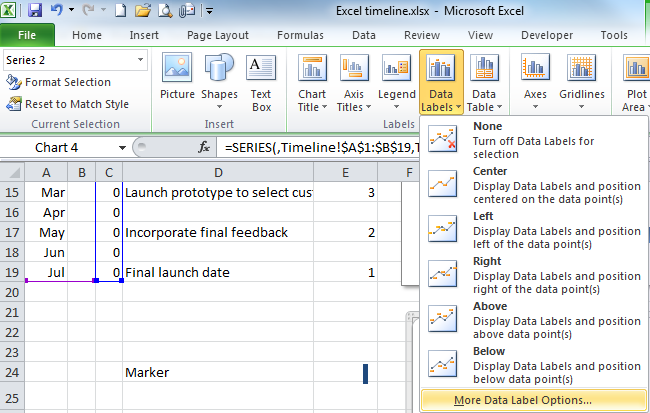
  3. Then click on Data Labels > More Data Label Options.data labels
  4. In the menu box that appears, choose Category name and Below then press the Close button.format data labels
  5. Repeat steps 1 to 4 for Series 1, and choose Category Name and Outside End.
  6. The chart should appear as below:chart 8

Step 7: Final formatting

  1. If any of the data labels are not perfectly positioned, you can double click on them and then move them into the position you would prefer.  For example in the chart above the label “Final prototype trial” crosses over one of the lines and needs to be moved to the left.
  2. If you wish to make any of the labels stand out for example Jan 13 and Jan 14, double click on them and adjust the formatting.
  3. You can add shadow etc. as you wish.

And that is it!  Enjoy!  Once again, if you wish you can download the sample excel sheet here.Timeline

Alesandra Blakeston

Creating shapes with a gradient in PowerPoint 2010

One of my earlier posts showed how to create a Polaroid vector in Inkscape.  However at the time, I noted that if you wanted to use that Polaroid as a Powerpoint shape, if you saved the shape as an emf the gradient disappeared.  So I thought I would post how to add gradients in PowerPoint, for shapes or to create a realistic looking background.

Create a shape 

eg. Rectangle.  This method can be used to add any type of shape to a slide

Click on the insert tab & find the illustrations group

39

Click on the small down arrow below shapes

40

Then click on the rectangle shape in the rectangles group.

41

Drag the cross style cursor over the screen to draw the rectangle

42

Drag the circular / square placeholders to adjust the size and shape of the rectangle so that it fills the width of the slide

43

Adding a gradient

Right click on the shape and then select format shape.

44

Ensure fill is selected

Click on gradient fill

45

Click on the left gradient colour stop

Click on the Color down arrow

46

Choose white for the left gradient colour.

47

Repeat for the right gradient color, choosing a light grey

Remove the centre stop by dragging it downwards from the bar

48

Click on the Direction down arrow and choose linear down.  (This is the second option.  If you hover the mouse over the option, a tooltip with the name of the option will appear)

49

Ensure the angle is set to 90°.  If necessary, type in a new value or use the up and down arrows to adjust it.

50

If necessary remove the line.  Click on Line Color.

Click on No line.  Then click on Close

51

You should have this result

52

Gradient background

Create a realistic Polaroid vector

Open inkscape and draw a square.  To do this, click on the bezier curves and lines icon and draw a square by clicking on the page where the first three corners of the square would be, and then double click on the last corner to finish your shape.  It doesn’t matter if the square isn’t perfect – we don’t want a perfect square!  Also, do NOT use the automatic square tool!!!  The reason for this is so that you can turn the straight lines into curves later…

6263

Once you have done this, double click on the shape to show the nodes (in the picture above you can see four nodes three grey diamonds and one blue diamond (selected node).  In inkscape the diamond shape tells you that the node is a corner.  However we are going to make the vertical lines curved, so we need to change the type of node.  Select the node you wish to edit (when selected it will turn blue), then click on the make selected nodes symmetric and then the make selected nodes smooth icons.  This will add two smooth node handles to the node as shown below.

64  6566

You can then change the length etc so that there is a slight curve on the vertical edge.  Repeat for the other two corners until the square looks as shown below.

67

Now we need to add the fill.  Normally a Polaroid is a flat colour, but the light around it adds shadows, so we’re going to add a gradient and remove the line.  With the object selected, the Fill & Stroke bar should appear at the bottom of the screen.  Double click on the fill to open the fill and stroke panel.

69 68

On the fill tab, click on the linear gradient button.

70

Often you will need to edit the gradient, so click on the edit button and change the stops of the gradient.  I made the first stop white (255,255,255,255) and the second stop light grey (230,230,230,255).

71

Then I need to change the angle of the gradient, so click on the create and edit gradients button and move the start and end stop positions as shown below.

72

Click on the stroke tab and then on the X button to remove the stroke (outer edge).  The back part of your Polaroid is done.

To add a shadow, press Ctrl+D to create a duplicate and then press the End key to move the newly created duplicate behind the original.  With the new one still selected, choose a dark grey colour for the fill.  Then in the fill and stroke panel, increase the blur to 3.0 points.  Reposition the newly created shadow so that it is to one side of the original.

73

Now to add the place for the photo to go in.  Click the top rectangle.  Press Ctrl+D to duplicate and then change the size of the new rectangle so that it is smaller and fits inside the original.  Change the fill to black.  Please note, you may need to alter the node handles slightly to get them to fit correctly.

74

Export the picture as a *.png and you are done.  You can also save the *.svg as an *.emf if you wish to use the drawing in PowerPoint for example.  However, the *.emf format does not support gradients, so you will need to add them back in once you import the *.emf to PowerPoint.

Final point, if you are intending to use this in PowerPoint, once one is complete, it is very easy to create others with slightly different curves to make a really professional slide.  Enjoy!

Create a simple button set

If you are not so good at drawing, either freehand or on a computer, you have probably used Google search or another tool to find your icons in the past.  There is another way however.

Firstly, if you haven’t already done so, download inkscape.

Then decide what icons you need. To get the idea, we are going to create these three icons… They are very simple, but I think you will agree, effective

75

Gear box (10 steps)

You may not be aware of it, but inkscape has the capability to render images by itself.  This is extremely useful!!!

  1. Create a new document by pressing Ctrl+N (if you don’t already have a new document open)
  2. Click on Extensions, Render and then Gear.
  3. Choose the number of teeth, in this case 8
  4. I’ve put a circular pitch and pressure angle of 10, but you can edit this if you want.  As the circular pitch increases, so does the size of the gear created.  The pressure angle makes the gear more or less pointy.
  5. Inkscape should then create automatically a gear for you
  6. Press Ctrl+G to ungroup the gear
  7. Then click on the circle tool and draw a circle in the centre of the newly created gear, holding down the Ctrl key as you draw the circle to ensure it is perfectly round.
  8. Position the circle exactly in the centre of the gear (you can use the Align and distribute panel to help with this by clicking on Shift+Ctrl+A)
  9. Change the fill of the gear to blue and the fill of the circle to white and remove the stroke of both
  10. Then select both by clicking on them and holding down the shift key and then click on Path and Difference or hold down Ctrl+-.  This will create a transparent centre to the gear.

76 77

I have made mine more rounded by deleting the nodes in the outer circle of the gear (the square blue nodes shown below).  To do this, double click the shape so the nodes can be seen and then one by one, click on the nodes shown while holding down the shift key and then when all are selected, press the delete key.  You can also alter the trajectory of the modes, by adjusting the node handles (red circles when clicked or hovered over)

78 79

House (17 steps)

The house is created by adding and subtracting the basic shapes together.

  1. First draw a square on the page (using the square tool in the same way that you created a circle for the gear
  2. Change the fill to blue and remove the stroke
  3. Add rounded corners, by double clicking the square and then changing the Rx and Ry values for the square to 1
  4. To make the roof, create another blue square.  Do not give it rounded corners.  If necessary, adjusy the Rx and Ry values to 0
  5. Click on Ctrl+Shift+M to open the transform panel and then rotate the rectangle 45 degrees
  6. Position the new diamond on top of the square to make the roof, adjusting the size until they match widths
  7. Then click on both objects and press Ctrl++ to merge the two together
  8. Double click the house to remove the nodes creating the gap btween the rounded rectangle and the roof
  9. Create a second smaller white rectangle to create the door and change its Rx and Ry values to 1
  10. Click on both objects and click on Path and Difference or hold down Ctrl+-.  This will make the door transparent
  11. You now have the basic house
  12. Create a duplicate of the house and with the Ctrl key held down increase its size so that it is slightly larger than the first
  13. Create a duplicate of your duplicate, and colour it white
  14. Position it slightly below the first duplicate
  15. Select the two duplicates and click on Path and Difference or hold down Ctrl+-.  This will create the roof
  16. To create the chimney create a small rectangle and a duplicate of the roof.  Subtract the roof from the rectangle
  17. Position all of the items where you want them (house, roof and chimney) and then press Ctrl++ to merge them together

80 81 82

Telephone

This is done using the trace bitmap function.  When using simple shapes just won’t work, then we cheat!

  1. Google the word telephone using google image. Find an image that is simple that you want to use.  Search tems like telephone or telephone icon etc…
  2. Import the picture into inkscape by clicking Ctrl+I and choosing the image you’ve downloaded
  3. Then with the image selected click on Shift+Alt+B
  4. Adjust the mode.  In this case I have chosen multiple scans, colours 2 scans and then pressed the OK button
  5. You should now have an inkscape object on top of the original image
  6. Move the inkscape object and delete the old image
  7. Press Ctrl+G to ungroup the 2 scans and then click on Path and Difference or hold down Ctrl+-.  This will create the basic telephone image, which you can colour blue and edit using the nodes and node handles, until you have the image you want

83

All that remains is to create the background buttons

Button (5 steps)

Depending on your style, you can choose to use round or square buttons, but they and the icons should all be the same size.  I’m going to show you how to create square ones.

  1. Create a rounded rectangle
  2. Open the fill and stroke panel and choose a linear gradient
  3. Adjust the gradient as you want it, I have chosen white to grey with a diagonal fill.
  4. Duplicate the rectangle and position it behind the first
  5. Change the fill to dark grey and add a 3pt blur to the rectangle

84

Join them together (3 steps)

  1. Duplicate the buttons, one for each icon
  2. Position the icons above the buttons
  3. Use the align pane to position each icon in the centre of a button

85